Crafting Time: Building an Analog Clock with React and Tailwind CSS
Covering hooks, audio manipulation, component theming and more...

Introduction
In the dynamic world of JavaScript frameworks, few hold their ground as solidly as React. Combine it with the elegance and simplicity of Tailwind CSS, and you've got a potent mix that is ideal for building user interfaces. In today's post, we're going to demonstrate just how powerful this combination can be.
At the heart of our clock will be React Hooks, a groundbreaking feature that lets us tap into React's capabilities like state and life-cycle methods without needing to write a class. Using hooks, we'll demonstrate how you can manage state and side effects more intuitively and simply, making our code cleaner and easier to understand.
Get ready to tick-tock your way to the completion of this exciting project, as we delve into the hands-on and rewarding process of creating a React-based analog clock. Tune in as we crank up the gears and set the hands of our coding journey in motion. Let's dive into the world of React, Tailwind CSS, and Hooks, shall we?
In my previous post, I shared a template for rapidly developing proof-of-concept projects. Today, we'll be utilizing it for this particular endeavor. If you haven't checked it out yet, I highly recommend doing so!
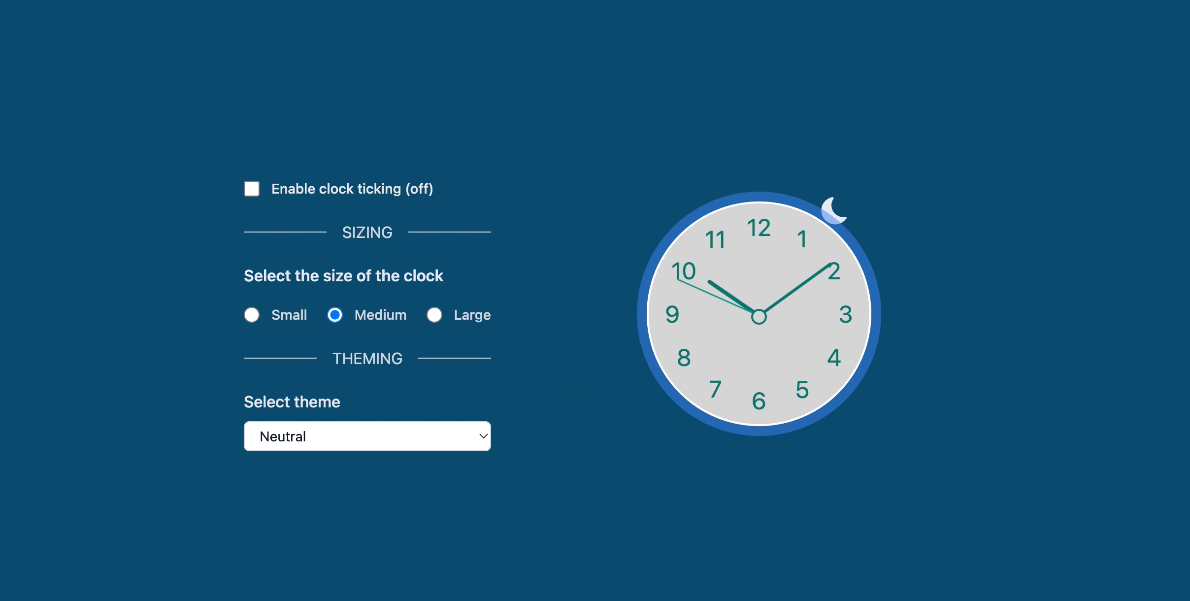
This is what we are gonna be building.
So, without further ado, let's embark on this exciting journey to create our very own customizable Analog Clock component in React!
Setting up the environment
First, let's clone the template (since it is a template you can also directly create a new project in Github by clicking in the Use this template button):
git clone https://github.com/aiherrera/vite-react-starter-template.git

# then enter in the new generated folder
cd vite-react-starter-template

# and open it with your favourite code editor, I use vscode ;)
code .
Hooks
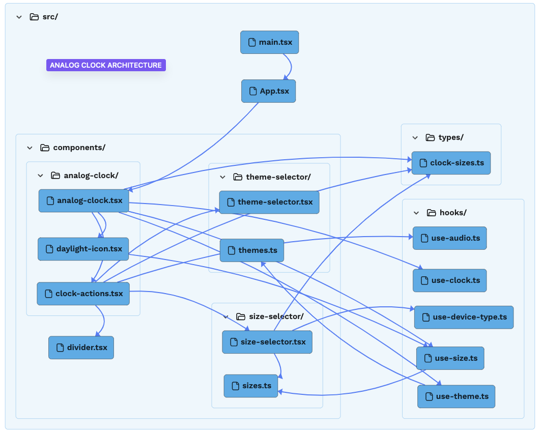
We are gonna extract some logic into custom hooks to encapsulate different reusable functionalities specific to our application requirements. These are them:
use-audio.ts - loads the audio URL for the clock ticking
use-clock.ts - handles all the clock mechanisms
use-device-type.ts - detects the device type based on the sizing
use-size.ts - used for handling the three clock sizes
use-theme.ts - handles the three theme examples (you can add your own... 😉 )
Creating the clock component
After that, we're going to create a new file called analog-clock.tsx and start to add some code to it.
This is pretty much the first part of it, let's break it down:
import { FC } from 'react'

import AnalogClockActions from './clock-actions'
import { ClockSizes } from '../../types/clock-sizes'
import useClock from '../../hooks/use-clock'
import useTheme from '../../hooks/use-theme'
import useSize from '../../hooks/use-size'
import DaylightIcon from './daylight-icon'

interface AnalogClockProps {
  defaultSize?: ClockSizes
  defaultTheme?: string
}

const AnalogClock: FC<AnalogClockProps> = ({
  defaultSize = 'medium',
  defaultTheme = 'neutral',
}) => {
  const [timing, isDaytime] = useClock()
  const [theme, updateTheme] = useTheme(defaultTheme)
  const [size, lastSize, updateSize] = useSize(defaultSize)

  const clockNumbers = Array.from({ length: 12 }, (_, i) => i + 1)

  return (
...
Here, we are importing all the necessary components and hooks that we've separated to streamline different logic and make some of them reusable.
We've added an interface for our component with two default values for the sizing and theming of the component respectively.
The
clockNumbersreceives a generated array with the clock numbers.Our
.tsxbegins with a component calledAnalogClockActionswhich will, as you may guess, hold the actions that we are gonna apply over the clock (sizing, ticking, theming...) Here we pass two functions for our hooks that updates the current theme and size of the clock and as a default the last known size if any.
...
<div className="flex w-full cursor-pointer flex-wrap items-center justify-center gap-x-40 gap-y-0">
  <AnalogClockActions
    updateTheme={updateTheme}
    updateSize={updateSize}
    defaultSize={lastSize}
  />
...
This component renders this side of the app:
- Then we added an Icon that is going to display a moon or a sun depending on your timezone (this is handled via
useClockhook)
...
<div className="group relative flex cursor-pointer items-center justify-center text-sm">
  <DaylightIcon isDaytime={isDaytime} lastSize={lastSize} />
...
- After that let's display our clock. Here we loop over our defined twelve hours and draw it inside a circle.
...
<div className={`${size?.dimension} ${theme?.main} ${theme?.shadow} relative flex items-center justify-center rounded-full`}>
  {clockNumbers.map((num) => (
     <label
       key={num}
       className={`absolute ${size?.numbers} text-center`}
       style={{ transform: `rotate(calc(${num}*(360deg/12)))` }}>
         <span
            className={`inline-block`}
            style={{ transform: `rotate(calc(${num}*(-360deg/12)))` }}
         >
           {num}
         </span>
       </label>
   ))}
...
You'll see there are some variables in the styles, they are defined in an individual file to make it reusable:
...
const AVALIABLE_SIZES = [
  {
    key: 'large',
    value: {
      daylight: 'h-10 w-10 right-12 -top-0 group-hover:-top-6',
      dimension: 'w-96 h-96',
      numbers: 'inset-5 text-5xl',
      center: 'h-4 w-4 -bottom-[3px]',
      hands: {
        hour: 'h-[6.5em] w-1.5',
        minute: 'h-[11em] w-1',
        second: 'h-[11em] w-[0.09em]',
      },
    },
  },
...
The same goes for the themes:
...
const AVALIABLE_THEMES = [
  {
    key: 'dark',
    value: {
      main: 'bg-slate-900 text-slate-300',
      shadow: 'shadow-xl shadow-slate-400',
      hand: {
        center: 'bg-slate-200 before:bg-slate-800',
        second: 'bg-slate-300',
        minute: 'bg-slate-300',
        hour: 'bg-slate-300',
      },
    },
  },
...
- And finally, we are adding a section for the clock center and hands (seconds, minutes & hours)
...
<section className="box-shadow: 0 25px 50px -12px rgb(0 0 0 / 0.25); absolute z-50 flex h-4 w-4 justify-center">
  {/* Clock center */}
  <span className={`${size?.center} ${theme?.hand.center} absolute z-50 flex rounded-full before:absolute before:left-0.5 before:top-0.5 before:h-3 before:w-3 before:justify-center before:rounded-full`}>
  </span>
  {/* Second hand */}
  <span className={`${size?.hands?.second} ${theme?.hand.second} absolute bottom-1.5 z-30 w-1 origin-bottom rounded-md`} style={timing.updateSeconds}>
  </span>
  {/* Minute hand */}
  <span className={`${size?.hands?.minute} ${theme?.hand.minute} absolute bottom-1.5 z-20 origin-bottom rounded-md`}               style={timing.updateMinutes}>
  </span>
  {/* Hour hand */}
  <span className={`${size?.hands?.hour} ${theme?.hand.hour} absolute bottom-1.5 z-10 origin-bottom divide-zinc-100 rounded-md`}               style={timing.updateHours}>
  </span>
</section>
...
The logic behind the clock hands' movement is found within the useClock hook, specifically in this code snippet:
...
setTiming({
 updateSeconds: { transform: `rotate(${currentTime.getSeconds() * 6}deg)` },
 updateMinutes: { transform: `rotate(${currentTime.getMinutes() * 6}deg)` },
 updateHours: { transform: `rotate(${currentTime.getHours() * 30 + currentTime.getMinutes() / 2}deg)`,
      },
})
...
In an analog clock, the minute and second hands complete a full rotation of 360 degrees within 60 units (minutes or seconds). Therefore, to determine the rotation degree for each unit, we divide 360 by 60, which equals 6. This means that each minute or second is represented by 6 degrees of rotation.
For the hour hand, we multiply by 30 because there are only twelve hours, and a full rotation of 360 degrees within 12 units equals 30. This means that each hour is represented by 30 degrees of rotation.
Children logic
Clock ticking
For audio manipulation, we encapsulated the logic within a hook called useAudio. This hook manages an HTML native audio element that receives a URL containing the source and an update function that toggles the audio on and off. This is controlled by a checkbox in the view.
Size handling
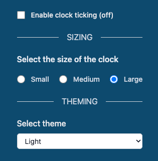
The size is handled with the useSize hook. It contains three important pieces to keep the state:
size=> handles the styles for each sizelastSize=> determines what was the last known sizeupdateSize=> updates the state based on the newly selected size by the user
The state is persisted in the browser's local storage.
Theme handling
The same strategy was employed for theme handling; it is controlled by the useTheme hook. This hook includes a theme object for styling and an updateTheme function for setting the new theme selected by the user. The state is also persisted in the browser's local storage.
Responsiveness
The component checks for a mobile device type using the useDeviceType hook. This, for instance, allows restricting the user from selecting the larger size of the clock that breaks the UI on small devices.
Defining Clock Sizes
We define a function getClockSize that returns the size of the clock, the size of the numbers, and the sizes of the hands based on the clockSize prop.
const getClockSize = () => {
  switch (clockSize) {
      case 'large':
        return {
          size: 'w-96 h-96',
          numbers: 'inset-5 text-3xl',
          center: 'h-4 w-4 -bottom-[3px]',
          hands: {
            hour: 'h-[6.5em] w-1.5',
            minute: 'h-[7em] w-1',
            second: 'h-[9em] w-1'
          },
        }

      case 'medium':
        return {
          size: 'w-56 h-56',
          numbers: 'inset-2 text-xl',
          center: 'h-2.5 w-2.5 bottom-[2px]',
          hands: {
            hour: 'h-[4.5em] w-[0.35em]',
            minute: 'h-[4.8em] w-[0.2em]',
            second: 'h-[5.4em] w-0.5',
          },
        }

      default:
        return {
          size: 'w-40 h-40',
          numbers: 'inset-1 text-lg',
          center: 'h-2 w-2 bottom-[2px]',
          hands: {
            hour: 'h-[2.8em] w-[0.2em]',
            minute: 'h-[3.3em] w-[0.15em]',
            second: 'h-[3.6em] w-0.5',
          },
        }
    }
}
Here's a breakdown of how the function works:
The
switchstatement is used to evaluate theclockSizevariable and determine the appropriate configuration for the clock based on its value.The
clockSizecan be'large', 'medium' or 'small', whatever the size, the function returns an object containing the following properties:size: A string representing the width and height of the clock (ex.'w-96 h-96').numbers: A string representing the styling for the hour numbers (ex.'inset-5 text-3xl').center: A string representing the styling for the center dot of the clock (ex.'h-4 w-4 -bottom-[3px]').hands: An object with properties representing the styling for the hour, minute, and second hands. Each property is a string of Tailwind CSS classes.
The purpose of this function is to provide a way to dynamically generate the appropriate styling configurations for different sizes of analog clocks based on the clockSize parameter. Encapsulating the configurations in this function allows for flexibility and reusability when creating analog clocks with different sizes and styles.
We call this function and store the result in clockUI.
const clockUI = getClockSize()
Defining Themes
The clock includes three predefined themes for testing purposes, but it is designed to be extensible, allowing you to add as many themes as you need or remove those that don't make sense or simply don't appeal to you 😵💫
const AVALIABLE_THEMES = [
  {
    key: 'dark',
    value: {
      main: 'bg-slate-900 text-slate-300',
      shadow: 'shadow-xl shadow-slate-400',
      hand: {
        center: 'bg-slate-200 before:bg-slate-800',
        second: 'bg-slate-300',
        minute: 'bg-slate-300',
        hour: 'bg-slate-300',
      },
    },
  },
  {
    key: 'light',
    value: {
      main: 'bg-slate-300 text-slate-800',
      shadow: 'shadow-xl shadow-slate-400',
      hand: {
        center: 'bg-slate-800 before:bg-slate-300',
        second: 'bg-slate-800',
        minute: 'bg-slate-600',
        hour: 'bg-slate-600',
      },
    },
  },
  {
    key: 'neutral',
    value: {
      main: 'bg-neutral-300 text-teal-700',
      shadow: 'ring-offset-[2px] ring-[10px] shadow-[10px 5px 10px rgba(0, 0, 0, 1)]',
      hand: {
        center: 'bg-teal-700 before:bg-neutral-300',
        second: 'bg-teal-600',
        minute: 'bg-teal-700',
        hour: 'bg-teal-700',
      },
    },
  },
]
The same approach utilized in clock sizing was employed here. Since multiple parts of the component can be modified, a section for it has been incorporated into the template.
Wrapping Up
And there you have it!
We've built a simple yet effective analog clock component in React. This component not only displays the current time, but it also updates itself every second to keep the time accurate. Additionally, we've added the ability to customize the size of the clock, templating and ticking functionality, giving us more flexibility in how we use this component in our applications.
Remember, this is an opinionated implementation, there are many ways you can extend/modify this component. You could add different themes, change the style of the clock hands, add a different ticking sound, or even make the clock interactive. The possibilities are endless when you're building with React.
Hopefully, this tutorial has helped you understand how to build dynamic components in React and gives you some ideas for your projects.
Happy coding!
Bonus
Here you can find the repository and there is a live version at Stackblitz.
Thank you for reading! Any constructive feedback is greatly appreciated!