Accessibility in Practice: How WCAG 2.2 Makes the Web More Usable for Everyone
Why accessibility is everyone’s responsibility
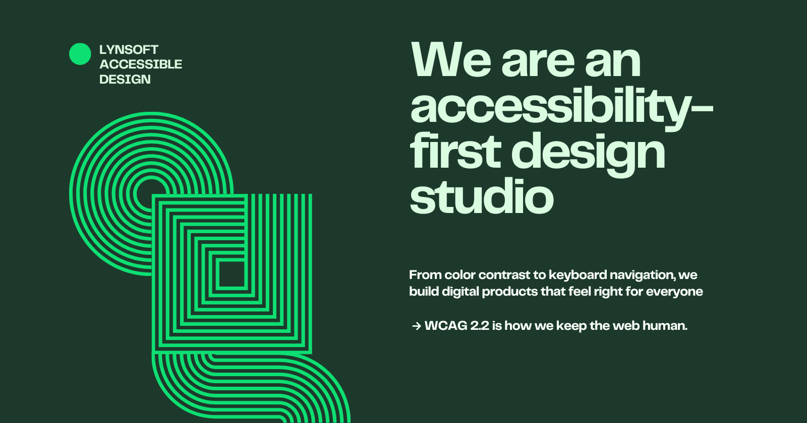
Accessibility is no longer a niche concern — it’s the foundation of good design. It ensures that everyone, regardless of their ability, device, or context, can use what we build. For developers and designers, it’s both a moral commitment and, increasingly, a legal requirement.
The Web Content Accessibility Guidelines (WCAG), published by the World Wide Web Consortium (W3C), define how to make web content more inclusive. The newest version, WCAG 2.2 (released October 2023), refines the standards set by 2.1 and introduces new success criteria to address mobile use, cognitive accessibility, and low-vision users.
The good news: if your site already conforms to WCAG 2.1, you’re most of the way there. But the updates in 2.2 highlight critical areas we often overlook — focus visibility, target sizes, authentication, and redundant input.
The four pillars of accessibility
WCAG 2.2, like its predecessors, is structured around four core principles — Perceivable, Operable, Understandable, and Robust (known by the acronym POUR).
Perceivable: Content must be presented in ways users can perceive (e.g., alt text, captions, sufficient contrast).
Operable: Interfaces must work for everyone, including those who rely on keyboards or assistive tech.
Understandable: Information and navigation should be easy to follow and consistent.
Robust: Content must work across technologies, from modern browsers to screen readers.
These principles are timeless. WCAG 2.2 builds on them by introducing criteria that reflect how people actually use the web today — particularly on mobile devices and with diverse input methods.
What’s new in WCAG 2.2
The WCAG 2.2 update adds nine new success criteria. Here are the most impactful for real-world development:
1. Focus Not Obscured (2.4.11 – Minimum / 2.4.12 – Enhanced)
Ever tabbed through a page and lost track of where you were?
WCAG 2.2 requires that the keyboard focus indicator remain visible at all times — not hidden by sticky headers, pop-ups, or overlays.
Real-life fix: In a modal dialog, give the focus outline a higher z-index and ensure sufficient contrast. Never rely on color alone to show focus.
2. Target Size (2.5.8 – Minimum)
Tiny touch targets are a nightmare for users with limited dexterity or tremors.
Now, interactive elements like buttons and links must be at least 24 × 24 CSS pixels, or provide adequate spacing.
Real-life fix: If your “Submit” button is 18 × 18 px, increase it to at least 44 × 44 px on mobile. Also ensure clickable icons have padding or invisible hit-areas.
3. Dragging Movements (2.5.7)
Some users can’t perform drag-and-drop actions easily.
Provide an alternative input method, like a button or keyboard shortcut.
Example: Allow reordering list items via arrow keys or “Move up/Move down” buttons in addition to drag-and-drop.
4. Redundant Entry (3.3.7)
Users shouldn’t have to re-enter information you already have.
Example: If your checkout form asks for the shipping address twice, autofill it from the profile or previous step. This helps users with cognitive or memory challenges.
5. Accessible Authentication (3.3.8)
CAPTCHAs and tricky password puzzles can block users with cognitive, visual, or motor disabilities.
Now, authentication processes must avoid memory or pattern-based tests without an accessible alternative.
Example: Replace complex image CAPTCHAs with accessible options (audio CAPTCHA, email link verification, or device push notification).
Accessibility in everyday design and development
Accessibility isn’t just about compliance — it’s about usability. Here’s how these guidelines translate into day-to-day decisions:
Design phase
Ensure color contrast meets AA (4.5:1) or AAA (7:1) standards.
Use consistent spacing, labels, and button styles to improve comprehension.
Provide visible focus states for all interactive elements — not just the keyboard user.
Development phase
Use semantic HTML (
<button>,<label>,<nav>,<main>) before adding ARIA roles.Test navigation with a keyboard only — no mouse, no touchpad.
Avoid “keyboard traps” where users can’t escape a modal or dropdown.
For touch interfaces, test buttons with physical devices and emulate hand tremors (many Android tools support this).
QA and testing phase
Include accessibility testing in CI/CD.
Use tools like axe DevTools, Lighthouse, or WAVE for automated checks.
Pair automated testing with manual screen reader tests (NVDA, VoiceOver).
Practical checklist for developers
Before shipping any feature, ask yourself:
Can every interactive element be reached and operated with a keyboard?Does the focus indicator stay visible and clear?Are tap targets at least 24×24 px with enough spacing?Do forms reuse known information instead of asking again?Are login flows accessible without CAPTCHAs or memory tasks?Does text have enough contrast, and are color cues not the only indicators?Have you tested with a screen reader and real users with assistive tech?
If you can answer “yes” to all, you’re likely WCAG 2.2 AA-ready.
The human side of accessibility
Accessibility is about empathy. Behind every guideline is a real person trying to do something simple — buy groceries, apply for a job, read the news.
A developer might see “2.5.8 Target Size,” but a user with Parkinson’s sees the difference between frustration and independence.
A designer might see “3.3.7 Redundant Entry,” but a person with dyslexia sees relief from repetitive effort.When we design inclusively, we make technology that respects people’s time, dignity, and capabilities.
Why accessibility makes business sense
Accessibility is often framed as a compliance issue, but it’s also smart business.
Broader audience: More than a billion people worldwide have some form of disability. Accessible design improves UX for all users — for example, captions help people in noisy environments, and high-contrast modes benefit mobile use in sunlight.
Legal protection: Regions such as the EU, U.S. (ADA + Section 508), and Canada already require digital accessibility for public and commercial websites.
SEO advantage: Many accessibility improvements (semantic HTML, descriptive links, alt text) improve search ranking and performance.
Brand trust: A commitment to inclusion sends a strong ethical signal to users, employees, and partners.
Final thoughts
The web was meant to be universal. WCAG 2.2 is our roadmap for keeping it that way.
For developers, accessibility is not a checklist to clear once — it’s an ongoing practice woven into design systems, component libraries, and engineering culture. By baking accessibility into every sprint, we build not only better products but a more equitable internet.
At Lynsoft, we believe accessibility is where empathy meets engineering. It’s not about perfection — it’s about intent. Every label we name, every contrast we test, and every flow we refine brings someone closer to inclusion. WCAG 2.2 helps us stay accountable to that mission: making the web usable, human, and open to everyone.
Because accessibility isn’t just good practice — it’s good design, good business, and good humanity.
References and further reading
W3C – Web Content Accessibility Guidelines (WCAG) 2.2: https://www.w3.org/TR/WCAG22/
Level Access – WCAG 2.2 AA Summary and Checklist: https://www.levelaccess.com/blog/wcag-2-2-aa-summary-and-checklist-for-website-owners/
AccessiBe – Understanding WCAG 2.2: https://accessibe.com/blog/knowledgebase/wcag-two-point-two
W3C WAI – New in WCAG 2.2: https://www.w3.org/WAI/standards-guidelines/wcag/new-in-22/